cool man

cool man
— scotty kilmer.
cool man
cool man
— scotty kilmer.
cool man

As usual, I will examine this piece following the 4-step analysis.
Part 1: Describe
In the center of the photo of the photo is a rather pale lady. Her face is very chiseled, and she seems to stare at the viewer, but seems to look past them as though she is focused on something else. Her eyelashes are white, and she is blushing under her eyes. Though she has a hairline, most of her hair is a slightly brighter pale than her skin. It is circular, though it extends far above her forehead. It appears to be illuminated, emitting pale colors that fade as they move away from her head. The lady is wearing a very subtle u-neck (almost an “o-neck”) shirt that is a light gray. Her arms are in the center of the bottom part of the illustration, and she is knitting strings that form a grid around her, the funnels into itself around her neck. Everything behind the grid, excluding the lady and her clothes, is black.
Part 2: Analyse
Most lines are defined, but do not end abruptly. To an extent, everything blends together. Overall, colors are ghostly and mysterious, being a pallet of pale, gray, and black. From some aspects, such as the lady’s skin, the texture seems to be soft, yet the light and darkness surrounding her seem rough-to-the-touch. Though the illustration is 2D, a great deal of detail was put into the hands and grid of what appears to be string around the lady. The strange combination of soft and hard, and the intriguing color pallet help immerse the viewer in the illustration. The contrast created between the soft skin and hard background is something difficult to pull off, but helps create a thought provoking illustration.
Part 3: Interpret
The lady’s blank look makes it seem she is “sewing” herself into a reality she doesn’t desire. It seems she is uncomfortable about the grid she has closed herself into. From that, this image seems to subtly portray the insides of the mind. Though an inherently powerful machine, it can easily overpower itself and bog itself down in overthinking, self degradation, etc., and sew itself into its own, oppressive reality. The mood of the illustration is grim, and strange, since the concept of mental health is a relatively new one.
Part 4: Judge
The work is thought-provoking, and makes the viewer ponder the nature of who we are, but only in the right circumstances. For many, this is a relatable issue, and as mental illness is on the rise, material like this could easily become the front of a revolution or movement for healthier lives, more attention to mental health issues, or something of the like. The artist uses the contrast of textures to create interest but also cautious curiosity in the viewer, and uses the color pallet to create a negative connotation to the image. That being said, most people do not hang the artwork of revolutions in their rooms, and accordingly, I would not put this in my room. It is more than just decor, it is an important piece of art that is representative of the state of humanity in the 21st century, plagued with issues that trap them in themselves, and trapped with a problem(s) that is barely understood by modern science.
Though this poster will be mainly educational, and to portray wearing your mask and staying home as a patriotic duty. It is meant for residents of the United States, given it suggests staying home and wearing PPE is a patriotic duty.The background will be an American Flag, infront of it being a person flexing their bicep (or posing in some way), with gloves and a mask through the window of their house. There will be text at the top, stating: “Protect yourself, Protect others, Promote Patriotism”. There will also be text at the bottom, in an eye catching font saying, “Only leave your house for essential purposes, and wearing a mask and gloves when leaving” The Color scheme will be . There may be touches of white and yellow, and maybe black for Personal Protective Equipment. The art will be 11×14.
Reference Photos:
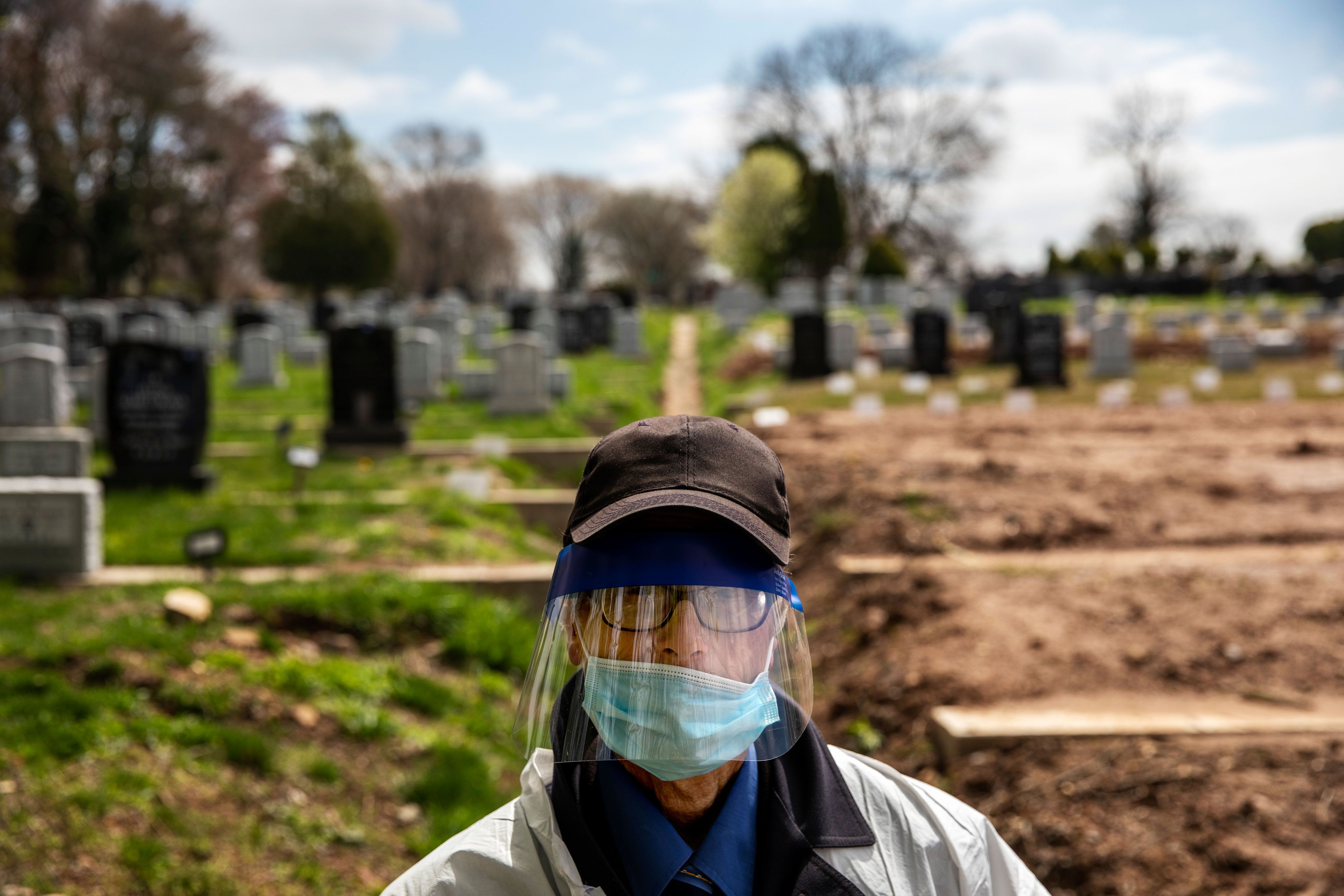
Though the graves would certainly not be integrated, the lady centered with a face visor and mask is an excellent representation of the person who would be flexing, or posing in some way.
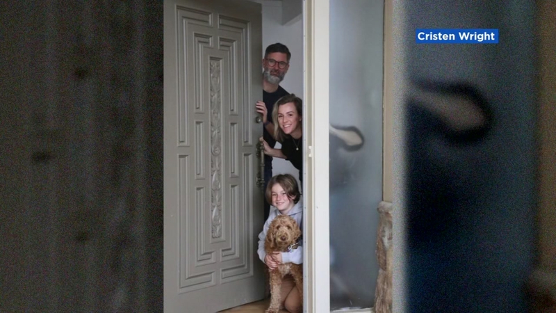
The idea of a family staying home whenever possible, paired with the protection of the lady in the previous photo would make for an ideal educational and inspirational photo, but the door would not be part of a house, but rather integrated into the american flag.
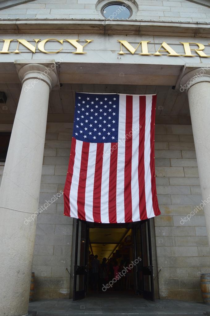
This hanging american flag is a good representation for what the background of the photo would be.
Inspirational works:
Obviously, an altered “We can do it” photo would be a strong influence on my work. My photo would have similar simplicity, with a relatively bold and short message in a similar eye catching font.

Though this photo is very simple, it serves as a good example for what the people may look like in my illustration. That being said, I would definitely give them gloves.


As usual, this feat of engineering will be analyzed through the tried-and-true 4-step process.
The photo is a landscape style, and is at the bottom of a brick wall surrounded by 6 in bezels of concrete. The sky is cloudless and deep blue, presumably during a summer day. The bricks ripple like a whitewater river. The crests are in a wave pattern, and some parts of the bricks jut out farther than other parts. The picture is very modern, taken within this year.
2. Analyse:
The general color of the photo is warm, but the borders are flanked by cooler colors of blue and gray. This photo relies heavily on the 3D effects of the bricks, which create the idea of wave crests on a choppy sea. Despite the relative ‘flowiness’ of the bricks, the material is clearly coarse and rough, which creates an interesting contrast to the flowing bricks. The sky and the bright orange bricks, illuminated by the sun, created an eye-catching look. Your eyes follow the ripples of the bricks, and the bezels of concrete make the bricks ‘pop’ even more.
3. Interpret:
The artwork shows a fusion of past design and modern technology. Bricks, in use since the dawn of civilization (though made of mud and manure instead of clay), have followed a similar, linear pattern for much of civilization. However, the combination of new technology and a tried-and-true building technique creates an interesting and unique structure to look at. The picture is very calm, and the blue sky adds a touch of optimism. Technology, combined with innovations of the past create beautiful and unique structures, following the old saying “Old becomes new”. My question would be what motivated the artist to create this structure. Though interesting, it seems to convey no message, other than to exhibit the potential of technology.
4. Judge:
This artwork exhibits the capability of technology, and the overall advancements of mankind. That being said, it lacks boldness and/or originality to be hung in my room. It is too plain. Though interesting, it has little meaning and lacks much contrast. The style of the wall is unique, and I would like to see it integrated into public spaces, such as neighborhood walls, highway dividers, etc. The issue with the picture itself is that it focuses so much on the wall itself, it loses a lot of value, since it seems to just be a picture of something.

As usual, my analysis of this artwork will follow the 4 step guide, with an earth day themed twist in the mix. The art is titled: “Inheritance” and created by Jennifer Luxton.
At face value, a sitting, diapered toddler who is vividly upset, sits infront of a planet earth, about as tall as his cheek to his foot. It is smaller than the child. Both the earth and the child are dark red, but almost a hazy orange, not far different then the kind you may see on the eve of a forest fire. Even the diaper, which is supposed to be white is a hazy orange-red, and the hair is dark orange-red, not quite black. At the top of the earth, there is fire, but it appears that the earth is falling given the fire is standing very tall but also angled slightly to the right. Surrounding the earth is a hellish-halo of bright white, even under the fire on the top of the earth. The child, mouth open, eyes closed in what seems to be desperation and sadness, bears witness to a burning planet earth in an otherwise sterile void of light green, as if its is nothing but a paper record, or simply a void. Interestingly, there is a great deal of detail on the child’s ear as well. Perhaps it suggests the baby is desperate for help, and will listen to anyone/anything, but that is wholly speculative.
2. Analyse:
Aside from the child’s front hair, facial expressions, and a few other locations, most of the image is not “defined”. Rather, blobs of slightly differing shades seem to combine into the shapes shown in the art. Though the color pallet is not an eye-catching red, it’s thought provocative. It’s a hazy, light red. The front and back of the baby are both lighter than the middle of the body, as if the light of a fire is striking both sides of the baby. The texture seems coarse. Because of the shading, nothing seems flat or uniform. If you were to run your finger over it, the assumption is a scaly and rough surface. Using the slight variations of shades, the viewers eyes follow the body, to the earth, to the flames, or the other way around. The shading guides and points out elements the artist wanted to emphasize.
3. Interpert:
The artwork is about the earth that the next generation will inheret. The title clearly states that, with the singular word “inheritance”. The artist suggests that with no action, the next generation will receive an earth in shambles. The art evokes sadness, disappointment and fear. This art is part of an ever-increasing movement to cast light on the poor state of earth. Though I assume it is predominantly focused on climate change, given the color pallet of the art, I would ask the artist if there were any other factors that she wanted to illustrate. With all of that being said, the earth on fire makes it blunt; our children will get a hellscape if we do nothing to stop it.
4. Judge:
The timeliness of this artwork is excellent. As the public begins to forget the exit of the Paris Accord, and major gas and oil companies air commercials about saving the earth, this art is a blunt and honest reminder of what will become of the earth if we continue to maintain the current state of our society and industry, both of which are predominantly powered through coal, use excessive amounts of plastics and chemicals in foods and domestic goods, and produces tremendous amounts of unnecessary waste. The artwork, even its title, are upfront and blunt. That being said, the picture is thought-provocative and will resonate with many as fear-mongering. Though the fears are based in truth, to the uneducated and ignorant, it would not help in persuading them to change their lifestyles. In other words, this illustration will not resonate with who it needs to, in order to make a serious change. I wouldn’t hang this work in my room either. It is not something that should currently be in a gallery. It is important, and should be the face of an eco-friendly energy and industry revolution, but like similar movements in the past, this work is not meant to sit in someone’s room. It’s meant to be put onto signs of protesters and circulated in the news.
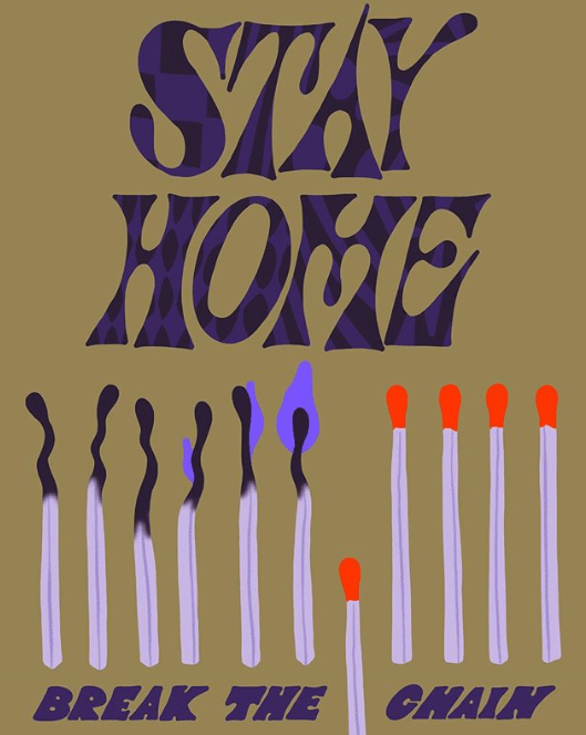
As usual, I will examine this piece with a 4 part analysis.
I see a portrait, light brown background photo. At the top is purple text with varying black patterns inside each letter, such as a checkered style pattern of black an purple in the S, horizontal black lines through the purple T, purple bubbles in the A, and many oval or line patterns integrated into the other letters, with a mystery-machine esq font. It reads “Stay Home”, in all capitals, with one word per line. It is very large and takes up nearly 1/2 of the image. Immediately below is 6 burnt out matches, with the upper part being a very dark purple (nearly black). They are squiggled at the top and bend in different directions, as a burnt-out match would be. The un-burned stalks are very light purple (almost white), and have a dark-gray, light lavender line through the middle. On the rightmost 3 burnt-out matches, there is an increasingly large, fairly dark purple that increases in size for the last 3 burnout matches. At the rightmost, burnout match with the largest fire on it, there is a match that has its tip at the middle of the rightmost burnout match. It is removed from the otherwise equally tall row of matches. Next to this unlit match (on its right), there are 4 more unlit matches with bright red tips (that aren’t burned), with the same colored stalks as the burnt out matches, and are at the same height as the burnt out or burning matches. Below these matches is a bolded, dark purple 80’s or 70’s style, Italicized font that says in all caps; “Break the chain”. “the” and “chain” are divided by the match that is lower down than the rest of them (6 over from the leftmost match) .
2. Analyse:
The color pallet is a choice that has dark elements, but evokes an aire of brightness despite that. The textures are unchanging throughout the picture. They are smooth. Not glassy, rather just a flat surface. The picture is completely 2D. There is no dimension to the photo. The foreground is a monochrome, light brown, which helps create brightness and contrast in an otherwise, rather dark complected illustration. Most lines are curvy, thick, and dark. The varying patterns within the letters at the top of the art create a youthful sensation of energy and movement, since patterns in the letters change as your eyes move from letter to letter. Sticking out of this rather dull art are the red tipped, unburnt matches. This helps direct the viewer to the heart of the artwork, and its main idea. The italicized text at the bottom also helps add emphasis to the written idea at the bottom of the page, though the text is in the same, neutral textured, dark purple appearance as many of the other elements.
3. Interpert:
Unlike art reviewed in previous pieces, this art has a definition and a sole purpose made clear by the creator. Stay home, or you will spread the fire. The fire being the just-as-easily spreading corona virus. The mood seems surprisingly optimistic, the colors just don’t evoke a sensation of fear, but rather, a sensation of empowerment, that you can be the one to break the chain. The artist wants you to see that aforementioned idea, that you can be the one who can break the trend, as long as you stay home. Given our current circumstances, the directness and simplicity of this artwork makes sense. We live in a time where knowing what we need to do and simplicity is something sorely needed. With that being said, I would ask the artist why they used so much purple. I understand it has a less “in your face” connotation than red, but even so, I am just curious why this color was the final product.
4. Judge:
This artwork is perfect for a museum. It is trying to evoke a simple and upfront message, similar to the “We can do it!” posters of the 1940s, and similar works of art created in times of crisis to evoke easy to understand messages, and people trying to study this unstable time will look back to works like these to understand the climate of the early 2020s. The main strength is the directness and mood of the poster. It is optimistic, but also enlightening. The color pallet does not make you afraid or surprised, but it gets the point across, but putting the meaning of the art on itself. That being said, this wouldn’t hang in my room. Its really nothing more than a warning sign with more style. That being said, it will be studied like the “We can do it” posters of the 40’s, because its a direct warning sign that reveals a lot about the circumstances of our times, since it is created to warn about one of the largest issues of the early 2020s.
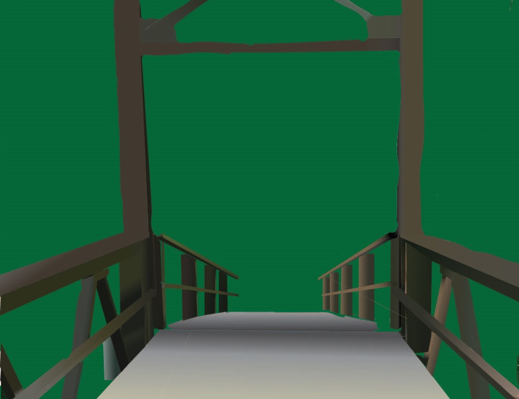
The final product. Though there is little contrast in the background, the bridge shows the perspective of the sun shining on the left half of the bridge. Rough on the edges, but due to time constraints this had to be the final product.
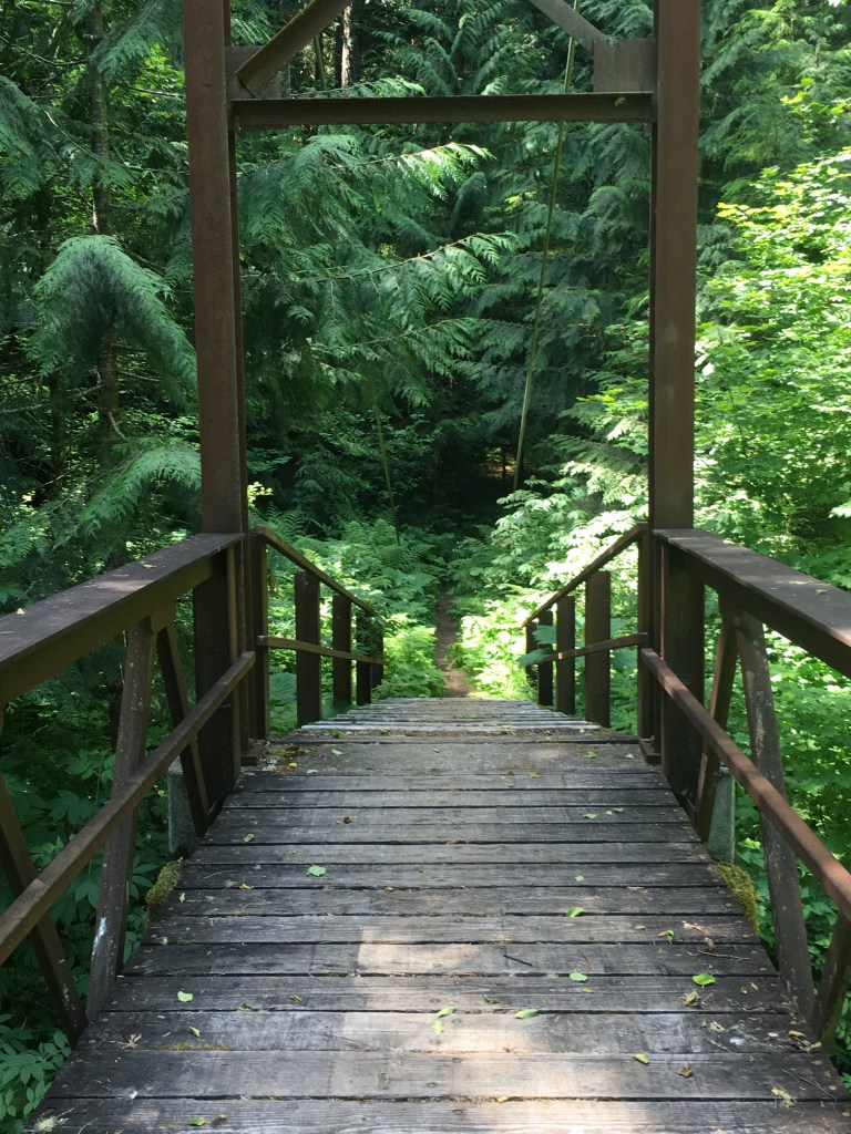
Inspired by the beauty of Ross Lake and its surrounding trails, I decided that it was the ideal location for a tonal vector landscape. Little did I know, the abundance of foliage made it a difficult task, but it all originated from this picture:
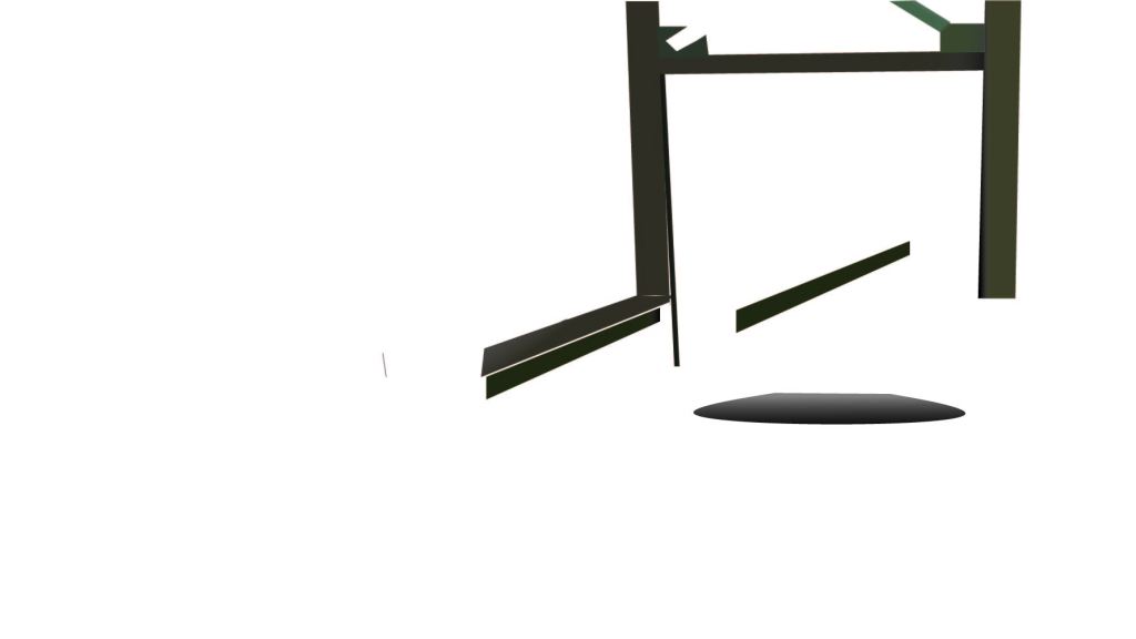
I do not have any pictures of the early parts of my work, but it began with the sloped wood path and the two large support beams and the wood enclosing the flat part of the walkway. In the middle, I focused on creating a gray and black (and yellow) gradient for the wooden path on the bridge, as well as filling out the upper supports of the bridge and continued on the ‘banister’ on the left and right of the walkway
The end product is at the top. Banisters along the entirety of the bridge were filled, the whole wooden path was filled as well as the dirt path, and a foliage inspired background was in place. Though not ideal, time constraints and my inherent lack of skill led to this background being the best option at the time.
Artist statement:
Named “Bridge of Foliage”, this art embodies the beauty of nature, and particularly that of the Pacific Northwest’s lush forests and the small trails that slither through them. It embodies the importance of nature. It is the lifeline to humanity, and the baseline for beauty, which is seen in the picture. The memories made along the trail, and the bridge itself, standing tall over the outflows of a roaring waterfall reveal nature not just as a provider, but as something that in the right light can be a merciful source of beauty. Starting from a picture I took, gradients and color swatches were mainly how I got to the image I wanted to produce. Gradients worked very well for reproducing the lighting and rust or other wise naturally occurring age on the bridge, and the foliage surrounding it. This bridge represents the better side of humanity. The father and son going for a walk along a trail, the boyfriend and girlfriend going for a hike. You are supposed to feel at ease–comfortable, but also respectful of the power you are walking around/with. As an artist, I intended to use this piece to better my ability at simplifying the “color map” of an image mainly through gradients. This piece helped hugely, through enabling me to use gradients repeatedly, and allow me to experiment with the eyedropper tool and a variety of brushes. I have overall become far better at Illustrator thanks to this project. I learned much of the basics through this project, but it certainly did not come out as intended. I expected something with far more detail, leaves individually traced out, but time and experience prohibited that from being a possibility. That being said, the right stair hands were pleasing, and I will reference parts of this piece I like and integrate those respective components into my future work. The most common application I will borrow from this is a heavy use of Gradients given their versatility.
TAG review (Done with Lisa Glasser)
The perspective from the bridge is a unique approach. I was wondering why the background was solid green. (Answer: A lack of skill and time meant individual leaves could not be traced out.) Having a less solid and all-filling green creates a more interesting background. Artists question: “What emotion does this photo evoke?”. Answer: It evokes a feeling of infinite possibility, given that the bridge looks out into an abyss that can be filled by whatever the viewer sees.

Titled “Banksy™ Met Ball”. Created by an anonymous artist named “Banksy”.
Using the 4-Stage critical analysis method to examine this piece, Its appearance and significance below.
Part 1–Describe:
On first glance there is a riot helmet with the protective shell covered with a disco-ball’s mirrors. The background is completely white, with the helmet itself mainly being a dark black or gray, except for the full-face, transparent ballistic shield that can be lifted above the user’s face via two rather large screws (likely nearly as large as a thumbprint). The shield appears to have been kicked or punched, or possible even pushed to the ground judging by the various scuff marks and dirt at the bottom and top lip of the face shield. Atop the face shield is a white box, in which a mid-value blue, and two to three finger wide, 40’s London-Subway-esque text reads “Police”. A dirtied rubber seal lines the edges of the helmet, seemingly on the edge of most of the helmet. By the cheek pads, this rubber is coated in powdery dirt. Along the top of the face-shield is a black, curved bar with bolts that secures the shield. From the picture there are 4 visible bolts, separated by a little over what appears to be an index finger’s length. These bolts and the curving bar itself are slightly rusted, and have visible scuff marks. It looks like it had been scratched by an aggressor. There are bolts (uncovered by the disco ball’s mirrors) on the bottom of the back of the helmet, securing a neck cover which appears to be stitched-leather, with spots of powdery dirt on it. The chin straps appear to be some type of fabric, with a large, plastic or rubber piece (which is also dark black and gray) on the end that curves to the bottom curve of a chin. There appears to be dirt in the seams where it was molded, but it overall has little visible wear. At the top of the helmet is a large rod, with a ring inserted through to top, with a chain connected to that ring, presumably to mount a discoball from the ceiling. It appears from the dirt that the helmet had been in some-kind of dispute of attack, as mentioned earlier, but from an on-the-surface view, there is no clear reason for how or why the disco ball’s mirrors are covering the shell of the helmet.
Part 2–Analyse
Upon close examination, there is a continuous repetition along the shell of the helmet. Each mirror is roughly a square or rectangle in lines. Each line is slightly over from the other, and no mirror is exactly alike. Besides the relative smoothness and cleanliness of the mirrors, the helmet itself is rough. The smooth mirrors sit atop a hard and likely coarse surface, which gives support to fabric that is hardened, stiff, and rough to the touch, with solid bolts and a solid face shield that are smooth at a glance but jagged and bumpy when touched. The leather neck shield jutting from the back also appears hardened. A once relatively soft surface turned hard and coarse. Aside from the mirrors, most of the materials on this helmet appear smooth but are actually rough and “unwelcoming” to the touch.
Part 3–Interpert.
To be honest, this artwork could be seen to have multiple, equally possible meanings. It evokes a very confrontational feeling, given the nature of the police helmet, but also a feeling of impending doom, with the partying of the disco-ball and rioting of the police helmet being combined together. The main idea I took from this helmet is that looking into the face of an officer at a protest or riot is like looking straight back at yourself. Under the helmet is another husband, son, mother, father, etc. When you look at them from a distance, they also seem put together, and they look strong, even smooth. But when you get close you see the tatters they truly are in. The age, and the dirt they have been coated in reveals a lifetime of hardship, and triumph–but triumph that is only awarded by difficult, dirty, in your-face struggles, but despite this, when they “land their face in the dirt”, they are hung up high for all to see, hence the inclusion of the chain at the top. The artist makes you think less about the protesters or rioters and more about the people who have to go in and keep each side as civil as possible, and how underneath the helmet they are just like anybody else. I am very curious whether the artist agrees with that interpretation.
4-Judge
The attention to detail of this art is impressive. It is clear a lot of passion was put into this piece, and each detail meant something to the creator(s). The main strengths are clarity and textures. The rows of mirrors point right back to you, and the look of softness but truly rough edge throw ideas right into your face about this piece. It is bold and unapologetic, and confrontational. Still, I wouldn’t hang it in my room. It is too polarizing and aggressive to be put onto casual display. It is so bold some may not appreciate it for what it is. However, it is an excellent time capsule for those who want to study early 2000’s culture, and the prolonged tensions between common-people and law enforcement.

Following the presentation of this seal, I have conducted a four stage analysis. It goes in order of Describing, analyzing, interpreting, and judging
Part one: Describing.
At face value, this logo has Mount Rainier and the I90 Bridge appear to be the focus of the fixture. The Bridge sits atop Lake Washington, and is seen through a low-lying field of trees, with one tree above the mountain from the perspective of the viewer. There is no color besides white and red. There are some waves, and the picture appears to be relatively timeless, though it is very realistic. The time of day and season is not made clear in the picture.
Part two: Analyse
The work is very structured, organized by layers ascending from the foliage at the bottom to the tree branch at the top. Lines, even if small, are very strong and bolded. The image is 2D, since nothing bulges out at you. The picture emits a cool “vibe”, with coarse and spanning textures on everything from the bridge, the foliage, to the mountain. The middle-ground, and foreground are clearly partitioned, since the mountains are separated by a bold and smooth line flowing across the horizon. The variation of shapes and flowing of the lines is used to created an image nice to look at, however, nothing about the seal is particularly eye catching. This is predominantly due to the limited pallet of the logo. Having only red, white, and rough textures (which appear to have been generated by a computer), they combine together to form a logo that is balanced between Red and White. Though the bridge and mountain, largely maroon objects are profound, the white lake balances out the marooness of those two large object. Outside of the circle of the landscape, another circle encloses the words Mercer Island School District in another thing circle surrounding the circle. The words Mercer Island are in a bolded, seemingly strong text. The focal point of the image is the mountain, a large, maroon object right in the middle of the seal.
Part 3: Interpert
The artwork represents the waterfront of Mercer Island. Examining this conjures up images of sitting by a dock with greenery in the water, looking out to the I90 Bridge with Mount Rainier right behind it, with snow surrounding its crest. It’s a very calm feeling that places great emphasis on the mountain and I90 Bridge, which seems to place a lot of significance on the beauty of the Northwest. Considering the formality of what the logo is representing, it makes sense the image is so “neutral” in circumstance. It is a formal, but calm and clean day on a rocky, Pacific Northwest beach looking out onto Mount Rainier and one of the longest floating bridges in the world.
Part 4: Judge
The best part of the work is the mountain. Despite being 2D, the clever use of whites for snow creates a more dimensional look to it than one would expect. The contrast created, despite a lack of colors is impressive. Your eyes are guided around the picture, following the textures rather than having to dart around looking at tons of colors, scripts, etc. I learned that simplicity is a large factor in whether or not a symbol/seal is able to be timeless. With that being said, the script in the seal shows its age. The semi-bubbly font of Mercer Island is showing its age. In addition, the landscape isn’t particularly eye catching. Using a slightly wider pallet of colors or gradients may make the picture more interesting to look at, and less forgettable. Adding more contrast and tones to the image would help it be more interesting to the viewer, while maintaining a relative simplicity to ensure it remains as timeless as possible.
What’s up gamers. Today we have made significant progress on developing the tonal vector Landscape.
Let’s start with the background.
For the background, I’ve chosen my own picture of a bridge along a trail in the North Cascade mountains, creating a green and brown color pallet to accompany it.
Here’s the unedited background:

Along with it is the color pallet:

As for the object on the foreground, this lucky man will be on the bridge.

So far, I’ve got the baseline. I’m looking forward to the shading and filling.
In order to start this off, I’d like to talk a little about myself.
I have one pet dog named Tucker. He talks!

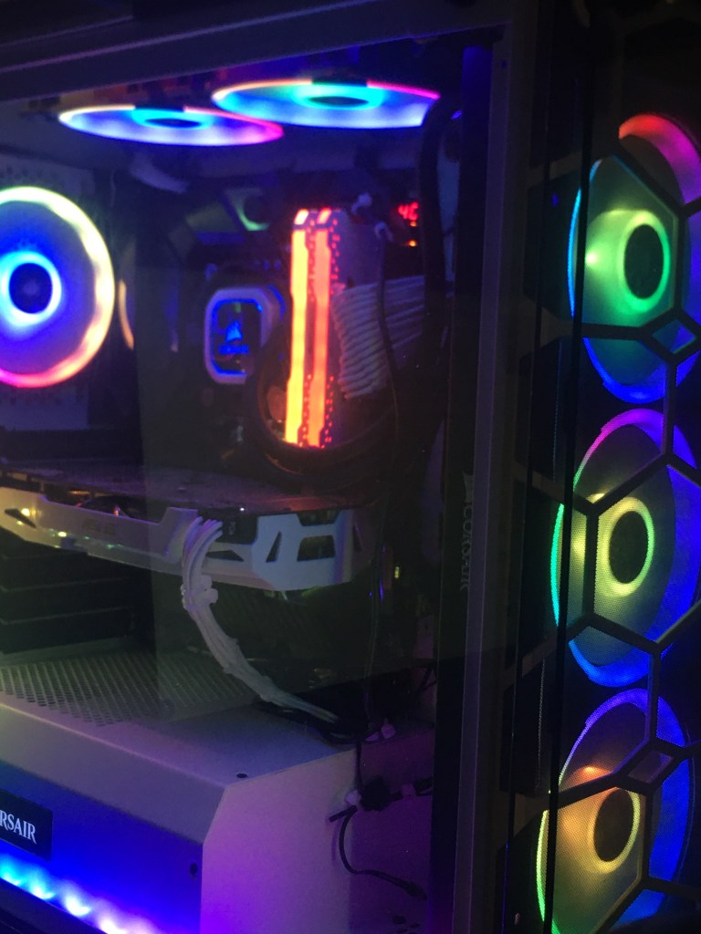
I have built my own computer. It has an i9 9900k and 1070 for those who are curious.
I have roughly 1,000 hours in Team Fortress Two. I love Valve games like L4D, CS:GO, TF2, and play Steam VR. Beatsaber and Pavlov are my favorite VR games.
Photoshop is one of my favorite pastimes.
The Sousaphone: “S” in the Mercer Island Band is me!

Walking and running is fun to me.
My Peer, Carson.
Carson is a character. He likes to run, participate in soccer, and watch YouTube. Something interesting about Carson is his personality is that he has nothing interesting. Carson has a pet dog named Wrigley. His dog is named after Wrigley field. Carson also speaks Spanish.
