As usual, I will examine this piece with a 4 part analysis.
- Describe:
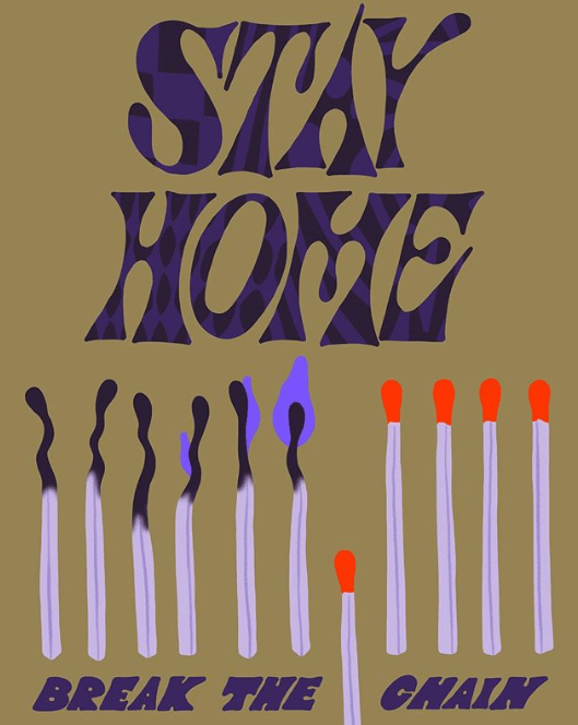
I see a portrait, light brown background photo. At the top is purple text with varying black patterns inside each letter, such as a checkered style pattern of black an purple in the S, horizontal black lines through the purple T, purple bubbles in the A, and many oval or line patterns integrated into the other letters, with a mystery-machine esq font. It reads “Stay Home”, in all capitals, with one word per line. It is very large and takes up nearly 1/2 of the image. Immediately below is 6 burnt out matches, with the upper part being a very dark purple (nearly black). They are squiggled at the top and bend in different directions, as a burnt-out match would be. The un-burned stalks are very light purple (almost white), and have a dark-gray, light lavender line through the middle. On the rightmost 3 burnt-out matches, there is an increasingly large, fairly dark purple that increases in size for the last 3 burnout matches. At the rightmost, burnout match with the largest fire on it, there is a match that has its tip at the middle of the rightmost burnout match. It is removed from the otherwise equally tall row of matches. Next to this unlit match (on its right), there are 4 more unlit matches with bright red tips (that aren’t burned), with the same colored stalks as the burnt out matches, and are at the same height as the burnt out or burning matches. Below these matches is a bolded, dark purple 80’s or 70’s style, Italicized font that says in all caps; “Break the chain”. “the” and “chain” are divided by the match that is lower down than the rest of them (6 over from the leftmost match) .
2. Analyse:
The color pallet is a choice that has dark elements, but evokes an aire of brightness despite that. The textures are unchanging throughout the picture. They are smooth. Not glassy, rather just a flat surface. The picture is completely 2D. There is no dimension to the photo. The foreground is a monochrome, light brown, which helps create brightness and contrast in an otherwise, rather dark complected illustration. Most lines are curvy, thick, and dark. The varying patterns within the letters at the top of the art create a youthful sensation of energy and movement, since patterns in the letters change as your eyes move from letter to letter. Sticking out of this rather dull art are the red tipped, unburnt matches. This helps direct the viewer to the heart of the artwork, and its main idea. The italicized text at the bottom also helps add emphasis to the written idea at the bottom of the page, though the text is in the same, neutral textured, dark purple appearance as many of the other elements.
3. Interpert:
Unlike art reviewed in previous pieces, this art has a definition and a sole purpose made clear by the creator. Stay home, or you will spread the fire. The fire being the just-as-easily spreading corona virus. The mood seems surprisingly optimistic, the colors just don’t evoke a sensation of fear, but rather, a sensation of empowerment, that you can be the one to break the chain. The artist wants you to see that aforementioned idea, that you can be the one who can break the trend, as long as you stay home. Given our current circumstances, the directness and simplicity of this artwork makes sense. We live in a time where knowing what we need to do and simplicity is something sorely needed. With that being said, I would ask the artist why they used so much purple. I understand it has a less “in your face” connotation than red, but even so, I am just curious why this color was the final product.
4. Judge:
This artwork is perfect for a museum. It is trying to evoke a simple and upfront message, similar to the “We can do it!” posters of the 1940s, and similar works of art created in times of crisis to evoke easy to understand messages, and people trying to study this unstable time will look back to works like these to understand the climate of the early 2020s. The main strength is the directness and mood of the poster. It is optimistic, but also enlightening. The color pallet does not make you afraid or surprised, but it gets the point across, but putting the meaning of the art on itself. That being said, this wouldn’t hang in my room. Its really nothing more than a warning sign with more style. That being said, it will be studied like the “We can do it” posters of the 40’s, because its a direct warning sign that reveals a lot about the circumstances of our times, since it is created to warn about one of the largest issues of the early 2020s.
