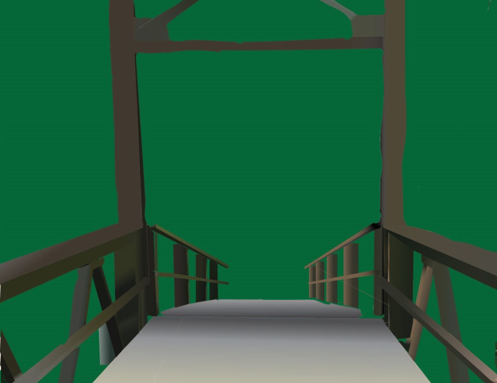
The final product. Though there is little contrast in the background, the bridge shows the perspective of the sun shining on the left half of the bridge. Rough on the edges, but due to time constraints this had to be the final product.
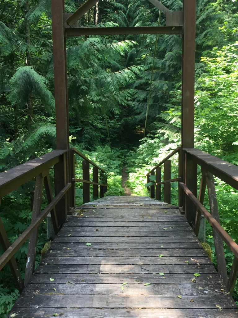
Inspired by the beauty of Ross Lake and its surrounding trails, I decided that it was the ideal location for a tonal vector landscape. Little did I know, the abundance of foliage made it a difficult task, but it all originated from this picture:
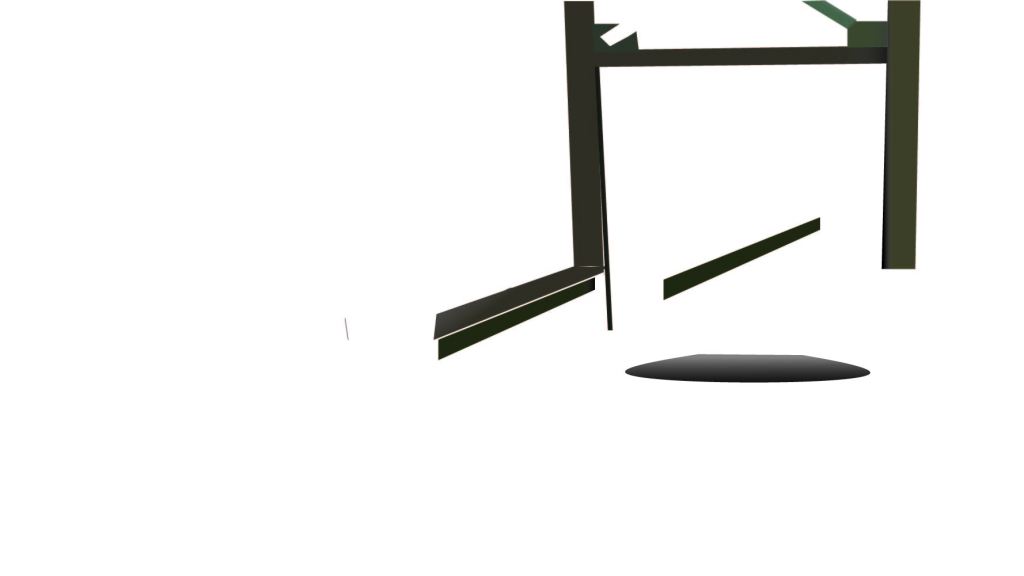
I do not have any pictures of the early parts of my work, but it began with the sloped wood path and the two large support beams and the wood enclosing the flat part of the walkway. In the middle, I focused on creating a gray and black (and yellow) gradient for the wooden path on the bridge, as well as filling out the upper supports of the bridge and continued on the ‘banister’ on the left and right of the walkway
The end product is at the top. Banisters along the entirety of the bridge were filled, the whole wooden path was filled as well as the dirt path, and a foliage inspired background was in place. Though not ideal, time constraints and my inherent lack of skill led to this background being the best option at the time.
Artist statement:
Named “Bridge of Foliage”, this art embodies the beauty of nature, and particularly that of the Pacific Northwest’s lush forests and the small trails that slither through them. It embodies the importance of nature. It is the lifeline to humanity, and the baseline for beauty, which is seen in the picture. The memories made along the trail, and the bridge itself, standing tall over the outflows of a roaring waterfall reveal nature not just as a provider, but as something that in the right light can be a merciful source of beauty. Starting from a picture I took, gradients and color swatches were mainly how I got to the image I wanted to produce. Gradients worked very well for reproducing the lighting and rust or other wise naturally occurring age on the bridge, and the foliage surrounding it. This bridge represents the better side of humanity. The father and son going for a walk along a trail, the boyfriend and girlfriend going for a hike. You are supposed to feel at ease–comfortable, but also respectful of the power you are walking around/with. As an artist, I intended to use this piece to better my ability at simplifying the “color map” of an image mainly through gradients. This piece helped hugely, through enabling me to use gradients repeatedly, and allow me to experiment with the eyedropper tool and a variety of brushes. I have overall become far better at Illustrator thanks to this project. I learned much of the basics through this project, but it certainly did not come out as intended. I expected something with far more detail, leaves individually traced out, but time and experience prohibited that from being a possibility. That being said, the right stair hands were pleasing, and I will reference parts of this piece I like and integrate those respective components into my future work. The most common application I will borrow from this is a heavy use of Gradients given their versatility.
TAG review (Done with Lisa Glasser)
The perspective from the bridge is a unique approach. I was wondering why the background was solid green. (Answer: A lack of skill and time meant individual leaves could not be traced out.) Having a less solid and all-filling green creates a more interesting background. Artists question: “What emotion does this photo evoke?”. Answer: It evokes a feeling of infinite possibility, given that the bridge looks out into an abyss that can be filled by whatever the viewer sees.
